Promotional campaign for the Architecture Faculty at La Sapienza University of Rome.

REFERENCES
The typographic products analyzed have been developed in four variations to represent the programs at the Faculty of Architecture, “La Sapienza” University in Rome: Single-cycle Architecture, Building Process Management, Industrial Design, and Landscape and Environmental Planning and Management.
The materials produced include posters, editorial prints, flyers, and postcards. A common feature across these designs is a graphic representation inspired by the study of the following case studies:
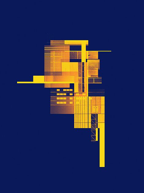
Jess Nordquist – Architectonic, 2013
Jess Nordquist is a freelance graphic designer and editor based in the United States. Her work focuses on the decomposition of images into planes and linear elements, with a notable emphasis on tonal variations achieved through the overlapping of different colored elements.

Close Up
In film, television, and photography, a close-up is a shot that tightly frames a person or object. It’s fascinating to observe the perceptual difference between a real-life image and a close-up.

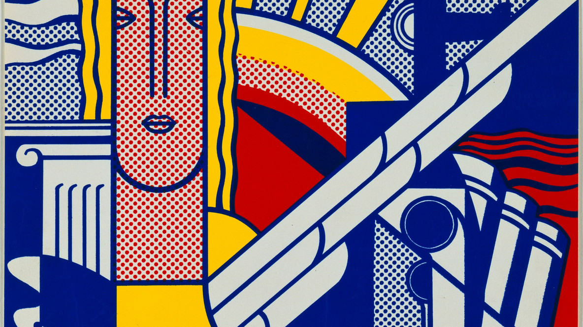
Roy Lichtenstein
The American artist is deeply connected to Pop Art and the world of comics. His unique style is instantly recognizable, as each piece adopts the halftone technique. To print a color image, the image is separated into the four primary colors used in printing (black, yellow, cyan, and magenta). Due to printing constraints, comic artists use flat colors, either solid or halftoned depending on the intensity they wish to achieve, with areas typically filled with bold black lines. Lichtenstein employs the same technique, creating paintings that resemble comic strips using a process that simulates printing. The halftone pattern, often invisible to the naked eye in printed form, becomes much more apparent in his enlarged works, and the simulated halftone dots are a key feature of his recognizable style.
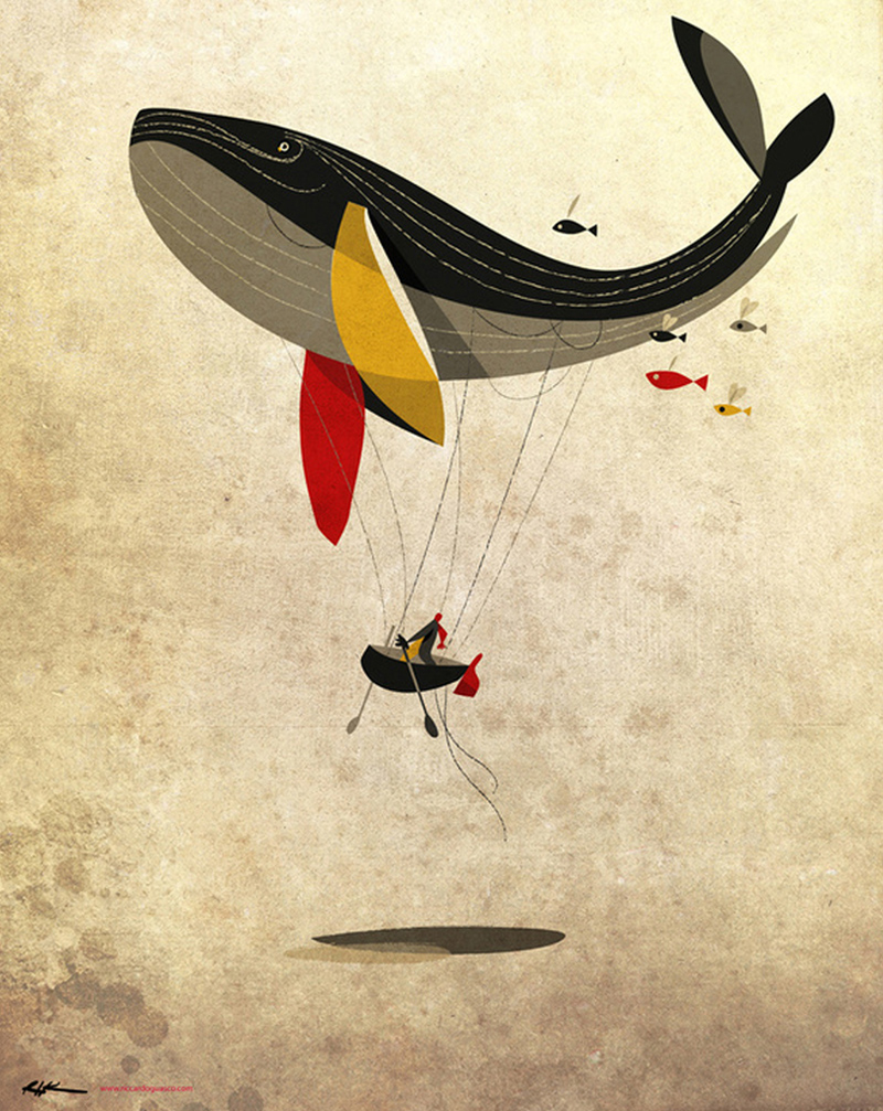
Riccardo Guasco
Riccardo Guasco is an Italian illustrator and painter strongly influenced by movements like Cubism and Futurism. His illustrations are characterized by light, flowing shapes and a warm color palette. For this project, the use of flat colors and textured backgrounds was an inspiration, contributing to a sense of materiality in the design.
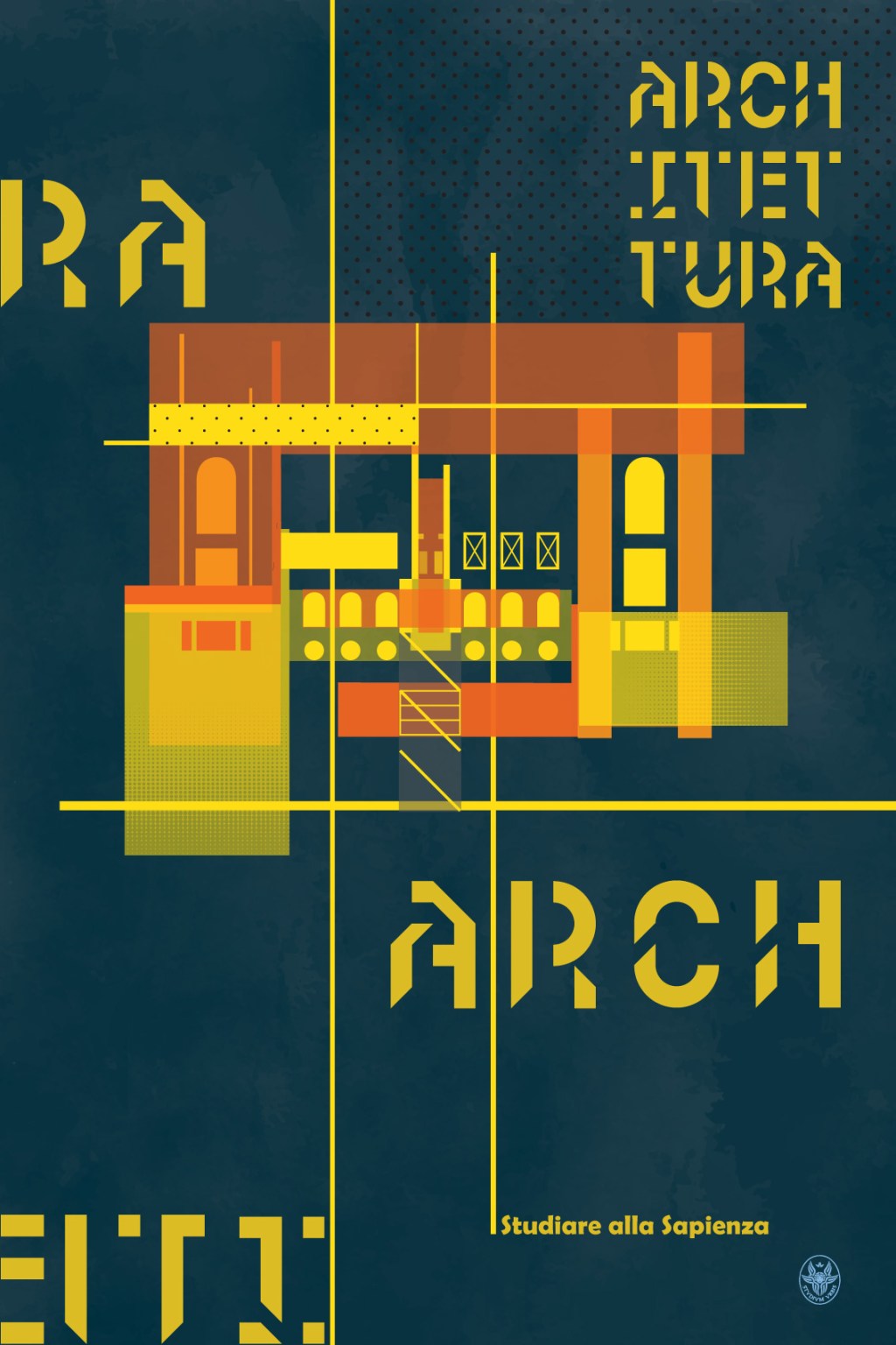
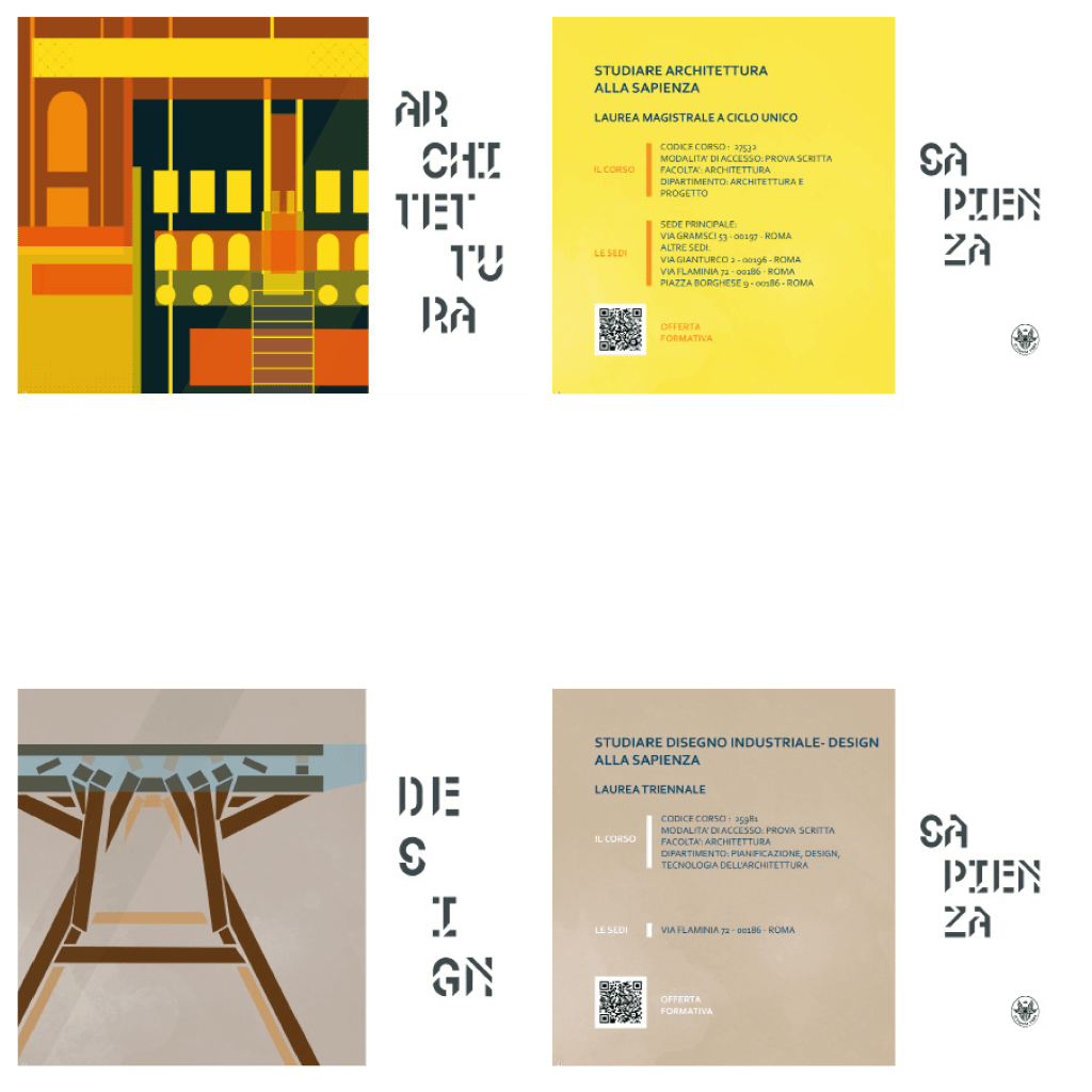
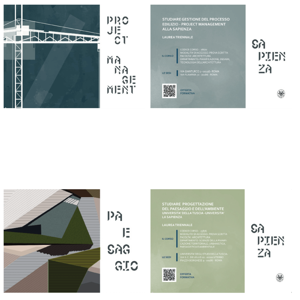
The first graphic product is the poster. Five final products were created to represent the four degree programs and the entire faculty. A 400×600 mm format was chosen for the design. Each program is represented by a unique image, which is then deconstructed, breaking the image into multiple layers.
The design concept linking the four posters, plus an additional fifth poster that summarizes the whole, is the intersection of planes derived from the original image, each defined by a specific color palette. Additionally, each poster incorporates elements of text and hatching, carefully positioned within the graphic space using a precise grid. Finally, the university’s logo is placed in the bottom-right corner of each design, alongside the slogan “Studying at Sapienza.”
POSTCARDS
The postcard follows the design concept of the Close-Up: a visual technique that involves depicting an object in an oversized, off-scale format. In film, television, and photography, this is typically referred to as a “close-up.” In photography, a close-up with even greater detail is known as a macro shot. It’s fascinating to observe the perceptual difference between a real-life image and a close-up.
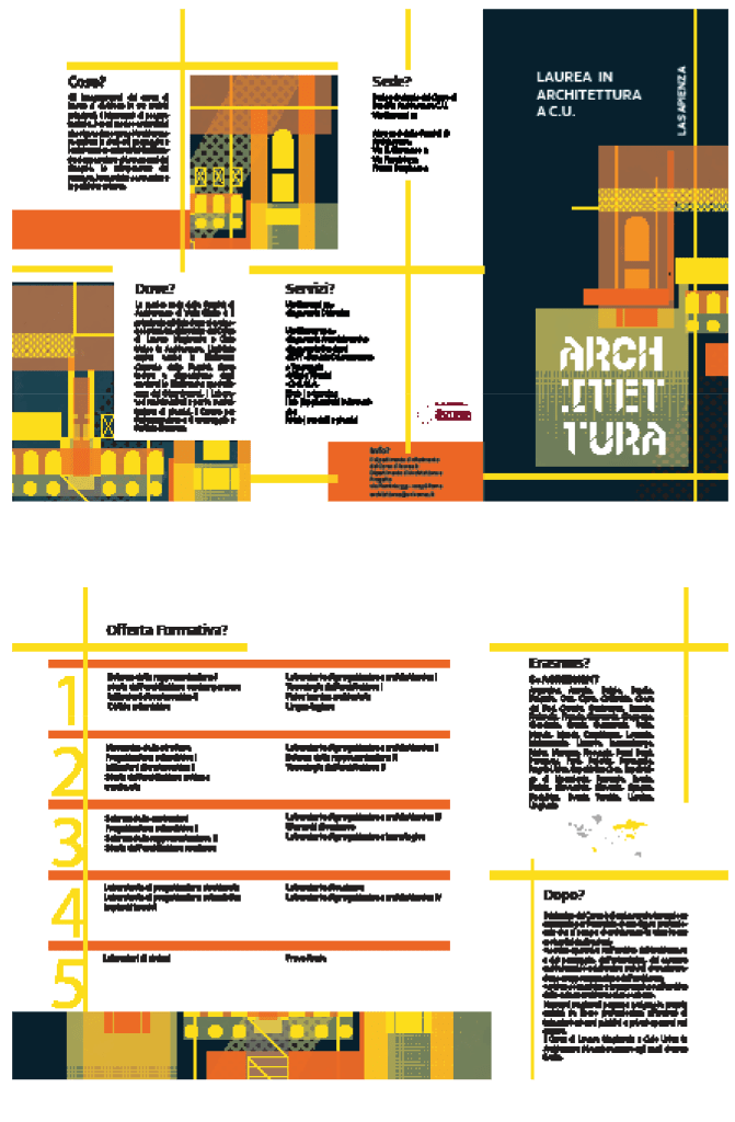
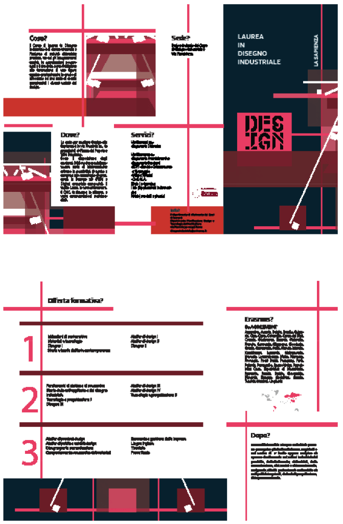
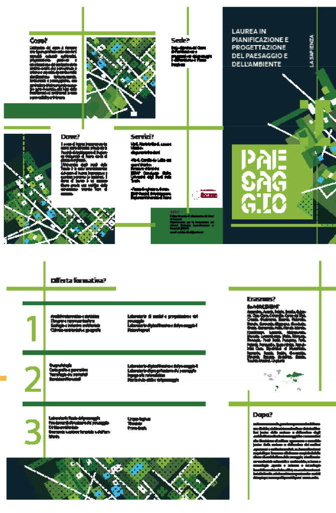
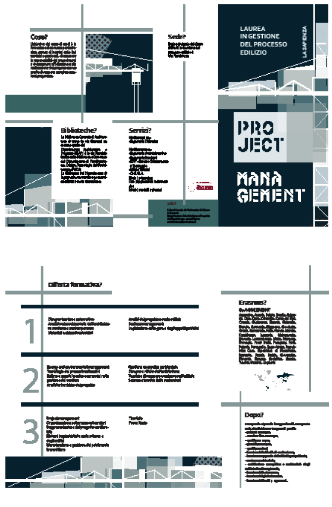
FLYER
For the flyer design, the same images used in the posters were repurposed. These images were processed using the Close-Up photographic technique, and from them, the main lines were extracted to form the basis of the layout for organizing the text. Initially, the A4 format with four panels was chosen, but to better accommodate the captions, it was decided to use an A4 format with three panels instead.

What’s your take? Drop a comment!